

On Work From Home Pt 2
Digging into the data

WFH Data Sources
While in the last article (link here in case you missed it) I emphasized the importance of vacancy as the ultimate metric, I would be remiss not to discuss the various office utilization data sources which have popped up after covid. These sources generally fall into two categories. The first is data that attempts to track actual worker office utilization, & the second consists of worker or firm surveys.
The main national data providers who track actual attendance are Kastle, which uses swipe card data, and Placer.AI, which uses cell phone tracking data. Most relevant for NYC we also have some LL reported data from Related and SL Green.
The major survey data sources are Scoop Technologies flex reports, the WFH Research survey, a Census survey and again on the NYC front a local NYC survey called the Partnership for New York. Another excellent NYC specific dataset is transit ridership. As you can see from the sources I look at, while I do cover several national datasets here, I am primarily concerned with Manhattan office space in my analysis here.
Each data set has its own pros and cons, which I will walk through here.
A few quick take aways for those who don’t want to read the entire article. Utilization is somewhere in the 50-75% range, depending on market and building quality. Based on LL data high end Manhattan appears to be the highest, and is basically nearly fully back in the office. Unfortunately we don’t have as good detail on the laggards, as unsurprisingly LL’s with awful utilization are not sharing those numbers.
A few markets, most notably SF/Silicon valley, generally show as underperforming and being closer to 40%.
Kastle shows a general leveling off, while Placer.AI shows continued improvement. At least for NYC, the Placer.AI data is massively larger, covering 180mm sf in Manhattan, while Kastle covers just 14mm sf with an unclear breakdown of suburban vs Manhattan. So based on size & detail I am inclined to view the Placer dataset as being superior. The NYC transit data, which is likely a decent proxy for Manhattan office usage trends if not absolute utilization, shows a continued positive increase in commuter ridership, and a good size step up after Labor Day.
My overall read based on the data is that for most office buildings & markets, return to office (RTO) has mostly continued throughout 2023. This is what Placer and WFH Research say. However the gains aren’t massive, and are not evenly distributed. My read of the Kastle data is that the smaller user segment of the market, which appears to be Kastle’s main customer base, seems to have mostly leveled off already in RTO.
Finally - it is important to understand my perspective here, which is as an investor in high quality office assets in top tier markets in general & Manhattan in particular (aka office REIT type assets). There is a wide divergence of utilization across geographies & building quality, so averages don’t mean much to me as they are simply too broad. The Manhattan data in particular is promising in that it appears to have the highest utilization rates, and rates continue to increase.
OK time to dive into the specifics.
Kastle
First up is probably the best known data source, Kastle Systems workplace occupancy barometer. Kastle Systems is a provider of office swipe cards and access control systems, and post covid they began tracking office swipe data at buildings which use their systems in order to track office utilization. The dataset consists of Kastle’s entire portfolio, and is broken up by city and compared against a pre-covid baseline figure.
Here is the latest summary chart.

As you can see, this shows a sharp drop after Covid struck, then slow but steady recovery until early 2023, at which point the figures have mostly leveled off.
At first glance, looking at this chart might lead you to think the office sector is doomed. Only ~50% occupancy, and stagnation since early 2023.
However there are a few items worth considering when thinking about the Kastle data set, which in my view make it less concerning that it may first appear.
The first thing to understand is that while a headline occupancy of 50% looks pretty bad, the proper way to think about office usage is that companies need to size their space not to the average usage, but to the maximum usage.
This concept is well known to anyone in engineering – you do not build anything to average usage tolerances, but realistic maximum tolerances. A bridge is a great example of this – you obviously don’t want it to only be able to handle the average number of expected cars, as then any above average day would cause a system failure.
So - in this context 50% doesn’t actually look quite so bad. If every firm in Kastle’s data set worked in the office 3 days a week, that would only be a 60% occupancy rate.
And at 3 days a week, firms are not able to easily downsize the amount of space they utilize. At 2 or 1 day you can relatively easily cycle in workers on alternating shifts and potentially shrink space significantly, but at 3 days this is not possible.
Therefore - a 50% occupancy rate does not mean a 50% reduction in demand for office space. Exactly what level of reduction depends on the distribution of firms by WFH policy - most firms at 3 days a week in the office and a handful at fully remote would be a relatively minor demand reduction, while a mix of 5 days and 0 days would have the greatest negative impact on demand.
A big issue with Kastle is its dataset is not comprehensive. The New York dataset (which is my primary concern) is based on 200 buildings, with 70k cardholders. That may seem like a lot, but the NY metro area has over 2.7 million office using employees per Census data.
At a density of 200 employees per square foot, Kastle’s 70k card holders would represent about 14 million square feet of office space. Kastle also appears to lump together suburban and urban space, so if we further assume the data is split 50/50 between Manhattan and the suburbs (which is roughly the breakdown of the market by square footage), then that means Kastle only has about 7 million square feet in Manhattan, or under 2% of the total square footage.
At this size, the dataset starts to look quite small, and becomes very susceptible to skew from the inclusion of certain employers (or lack thereof). For example JPM alone has nearly 7 million square feet of office space in NYC. Goldman has 2.1 million. Goldman is planning to ramp office attendance to 5 days a week - were Goldman to be in the Kastle data it would massively skew the occupancy numbers upward (Goldman is not included as far as I can tell).
Given Kastle’s data set consists of apparently 200 buildings in New York, this would imply that the average building size is relatively small with only ~350 card holders per building.1 This would mean that Kastle’s data is likely skewed towards smaller users, and likely does not include any of the city’s largest employers. This is important because the largest employers (banks, law firms etc), appear to be the strongest proponents of return to the office.
Therefore it appears to me that Kastle’s data is likely representative of smaller firms, but not of the overall market as it does not appear to include any of NYC’s larger office occupiers, who comprise a huge portion of the overall market.
So - I am hesitant to rely too much on the Kastle numbers as it appears to primarily cover smaller users, and may have a significant suburban component. That said, their data does seem to imply that return to office rates are leveling off for smaller users at least, which has important implications. 2
Landlord Data
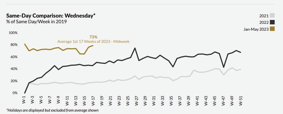
It would be useful to compare Kastle’s data to that of other major landlords. Luckily one of NYC’s largest landlords (particularly of class A space), Related Companies, has been quite vocal about their portfolio occupancy levels.
Jeff Blau, the CEO of Related Companies, had the following to say in an interview in the FT.
I been told that the above figures are against every single person with a badge, not a pre-covid baseline. So given travel, illness, etc the maximum occupancy is probably only 90-95%, meaning an 80% occupied office is even a bit better than it sounds.
If Related’s internal figures are to be believed, in NYC at least the top of the market is basically already back in the office. Now there is also some selection bias in this data as well, as firms who are going to spend $130 per foot leasing space in Hudson Yards are probably also much more inclined to utilize said office space. Still per Blau demand for this top end space is pretty good.

As another data point SL Green, which is the largest NYC office landlord, noted in its Q1 earnings call (which occurred April 20th) that weekday occupancy averaged over 60% on many weekdays. This is a bit vague and definitely lower than the Related figures, however its also worth noting that Related’s figures were reportedly more like 60% in Sept of 2022. So I would guess SLG’s figures have continued to creep up a bit from April, but SLG still has not released an update to this figure as of their recent Q3 earnings which isn’t a great sign.
These building specific data are unfortunately lacking in as much detail as I would like to see to draw any definitive conclusions, but broadly it appears to support that NYC’s office utilization levels are close to a critical threshold (60%), which would indicate a still significant, but manageable, total impact from WFH. Further it appears that the high end of the market is performing much more strongly than the average building, as seen in the performance of Hudson Yards.
Moving on, we have a few more data sources to cover.
Rebny/Placer.AI Data
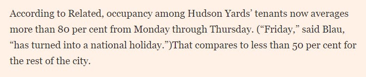
The Real Estate Board of New York also published an office utilization analysis in partnership with cell phone location analytics company Placer.AI.
This report (published in July & found here) used cell phone location data from 250 full buildings consisting of over 180 million square feet of space. The results from this report are overall pretty encouraging, but some caution is warranted based on the results and methodology.
They for some reason do not provide the overall average figure, but it looks to be ~59-64% depending on which methodology you use (baseline vs same day).
The same day methodology seems the most apples to apples to me, & overall the study finds that as of April 2023, same day occupancy rates (at least for midweek) were at 73% of 2019 levels on average, and almost 80% in April itself.
Friday however has a significantly slower increase, & has basically flatline from YE 2022 to April 2023.

What’s interesting here is that the data shows such a large jump at the beginning of 2023 - to me this makes sense as it matches many major corporations tying their return to office dates to major calendar dates (start of 2023 being a large one).
Given many more corporations have upped their return to office policies since April, and there are more large ones pending, it will be interesting to see what this data shows when REBNY next updates this report (if they ever do so, hopefully they do!).
Some caution is warranted here though, as cellphone location data is not perfect and Placer.AI used a proprietary algorithm to determine who is an employee or not.
The total visits index is not as strong, as you can see below.

Its important to note the methodology is slightly different - this is not same day comparisons, but is instead against a baseline measure. So the relatively smaller gap between weekday and weekend visits does imply a pretty significant non office component to visits. But retail square footage isn’t that large at most buildings so its a bit of a mystery to me how the weekend numbers could be so close to weekday - this would imply non office visits are a huge share of the total visits. Without knowing more about the building dataset or methodology its hard to truly unwrap what is going on here. Given what I would imagine to be the relative smaller share of retail traffic vs total traffic for most large buildings (and the average building sf here is 720k, so a good size), and the relative inaccuracy of cell phone location data, I would guess some decent portion of street traffic gets caught in this data.
That said I am encouraged by the sanity check included against the various NYC transit authority datasets, which are shown here. The transit figures would seem to broadly support the Placer.AI data as being fairly accurate midweek, although the large Mon/Fri mismatch is a bit strange.

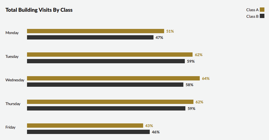
Finally - in further support of the increase utilization at class A buildings, Placer.AI data does indeed show higher midweek utilization at A buildings.
So overall - its hard to draw definitive conclusions from this data, but it does seem to support a pretty healthy and ongoing recovery in NYC office utilization rates. And this dataset has the benefit of being by far the broadest in terms of its coverage with its 180 million square feet of space.
Placer.AI also publishes its own RTO dataset independent of Rebny - this has less detail, but is much more recent so is worth touching on briefly here. This data (link here for Aug, here for Sept) shows continued slow but steady increase in office utilization, even over the summer which is a bit surprising to me. Also surprisingly, September showed a big decline down to 40%.

Note: Placer.AI did not create the same chart for September or otherwise I would have posted that more recent one, but I use this because it shows the long term trends which are useful. So this chart does NOT show the Sept decline - use your imagination to add it in.
This downtick for September frankly gives me concerns about how reliable this data is, as the decrease in utilization they show is the exact opposite of what Kastle’s data shows (a decent sized uptick post Labor day), NYC transit data shows, and also the actual announced corporate RTO mandates.3
They do provide a bit of market comparison data too, which show Manhattan leading the pack of in terms of office utilization. Again this is from August, the September report only compares NYC, Chicago and SF (all 3 are down same as the national trend).

I do wish they provided some more disclosure here on the underlying data as some things are counterintuitive. Most of the markets make sense but DC seems overly high to me given much of the federal government is heavily remote. It may be the sample areas or sizes are limited - for example DC may just be DC proper which could be skewed up by the heavy law firm concentration, an industry which is very in-office oriented, and may exclude Northern VA where many of the actual govt offices are. The overall sample is apparently based on 1,000 buildings, which would mean the count in any given market is actually relatively small.
Overall - while the Placer data is nice in that is it more comprehensive, some elements of it give me pause. Using anonymized cell phone location is in principal a very broad robust data source, but attributing the data to specific buildings I suspect requires some serious statistical transformations, which may introduce some error / uncertainty into the process. So the Placer data should be taken with a grain of salt, but the data is broadly positive for LLs & Manhattan in particular.
NYC Transit Data
Next is an indirect data source which may well be the most comprehensive of all, and that is NYC transit ridership data. The MTA publishes comprehensive daily data going back to before covid giving total visits and share against pre-covid use.
There are three main commuter buckets to review. The first is the subway - this has by far the largest ridership. However we have a problem in utilizing this data from an office user perspective, as a huge share of subway rides are not related to office visits. Unfortunately good data is not available (that I am aware of) on share of subway visits related to office usage.
A secondary problem here is that subway usage patterns seem to have changed from pre-covid use, even setting aside WFH. That is because weekend subway usage is still down ~25% from pre-covid levels & has basically been flat over the last year. A little bit of this may be tourism - a local tourism agency is projecting 2023 visits to be ~5% below 2019 numbers. But most of the decline clearly must be people walking, biking, or taxiing in lieu of taking the subway. Given the recent proliferation of bike lanes & continued installation of citi bike stations, biking is a lot easier and feels safer - personally I do a ton of it. This means it is very difficult to make comparisons against pre-covid data for subway usage, at least as far as office is concerned.
So instead I believe the LIRR and Metro North (two of NYC’s major commuter rail lines, the third being into New Jersey) are our best proxy for office usage. Now obviously not everyone on a suburban train during the week is going in to the office, but a much higher share are than the subway. Again I don’t have stats to quantify this, but if you spend any time in NYC it is fairly self evidently true.4
The ridership data here is pretty interesting, and would clearly seem to indicate a continued increase in return to office in New York over time.
Here is the LIRR weekday data for the last year. This pretty clearly shows a steady increase in utilization over time - up from ~60% to nearly 75% here in the last few weeks.

Now it is important to note that LIRR expanded access to Grand Central back in January, so the increase that month could be attributable to expanded service. Combined with the fact that we don’t know the office commuter share of overall traffic, and you can’t draw firm conclusions on total office utilization from this data.
However I do think you can look at the trends shown here, and make a reasonable assumption that the overall ongoing increase after Spring of 2023 is driven largely by increased numbers of workers going into the office.
Here is the same data for Metro North, which clearly shows the same trend, albeit with a smaller gain going from ~60% to ~70%.

What is interesting about both of these is that the major step ups coincide with major corporate RTO timings (new year, late spring, post labor day).
This data is really interesting as in some ways it is the most comprehensive of all (for NYC), in that it covers all of a certain class of commuters. And the trends here are pretty positive and show that return to office continues fairly steadily, at least in Manhattan.
Partnership for NYC Data
The final NYC specific data source worth mentioning is a survey produced by the Partnership for New York City, a local non profit. The latest survey just came out in September, and can be found here. This report is based on a survey of 140 corporations, and with an overall utilization rate of 58% (up from 52% in February), is in between the Kastle data (~50%), and the Placer data (~60%). The previous surveys have showed a slow but steady continued increase in utilization rates. What is nice about this data is it shows the distribution of office utilization between fully remote and fully in the office.
Not knowing which corporates were surveyed its hard to draw strong conclusions, but generally the survey seems to further triangulate the utilization rate range as being 50-75%, depending on data source & building type/quality.
Taking all the Manhattan specific data sources at face value, they would seem to indicate a few things. First, the overall utilization rate is probably somewhere in the 50-60% range. I would estimate that the Placer.AI data is likely the best given its much much broader than Kastle or the Partnership survey, and that the overall average is closer to ~60% than 50%.
Second - high end buildings have much higher utilization rates, closer to 75% for the top of the market if Related’s numbers are to be believed.
Third - utilization is slowly increasing over time. While Kastle shows leveling off, all the more specific data sources (Rebny, Partnership, & transit data), show continued increase in usage. As I said before I suspect the delta is driven by Kastle having a large suburban component and/or a lack of large corporate users in their data.
Other National Data Sets
Given my focus on NYC office, that is where I have spent most of my research time - however there are a couple of other national datasets worth mentioning here.
The first is the US Census. They do track telework via their CPS survey (they also have another survey but that one is lower quality), and lucky for us the latest data just came out. Here is the share of college educated workers who teleworked over the last 12 months.

The data does not show a clear trend line, but this question is fairly new (only dating to Oct 2022) and I suspect there is significant seasonality to the data which cannot be adjusted for yet due to lack of sufficient data. The seasonality would simply be vacation - this survey asks about what the respondents did in the last week - so it would make sense that telework is higher during typical vacation periods, which happens to be what this chart shows.
Here is the data for any remote at all. This is actually increasing which is interesting, however it is actually overall a good bit lower than the other data sources which are more in the 50-40% remote range.

Given these results conflict with all the other sources I am frankly not sure what to make of them. It is also worth noting that these data include all jobs, not just office using jobs, and this differing survey population may explain some of the differences.
Regardless - as the data is national it is far too broad for us to draw any firm conclusions. But at a minimum it is further evidence of how entrenched WFH is, and that hybrid work may be becoming more common over time. Definitely a dataset to watch over the next year.
The second is an organization called WFH Research. They conduct monthly surveys of 10,000 users across the US on WFH (previously 5k). Their data shows a gradual continued decline in WFH.

Again I don’t put a ton of weight on this data as its too broad. They do provide some metro level data (including NYC), and data breakdowns by industry, by in my view the survey size is just too small to make draw strong conclusions about a given area. The survey size is 10k total, so assuming proportional representation that means even NYC, one of the largest metros, would have about ~670 respondents. Breaking these down further by industry (they use the census categories, of which there are 14), and then you have a pretty small number of respondents by industry even for a metro area as large as NYC.
This is pretty clear in how ‘noisy’ some of the granular datasets look. For example fully remote ‘Information” employees (which should cover tech workers) dropped from 20% to 16% from June to July. This is a huge change! It somewhat gels with more tech RTO calls, but I suspect its really just survey variability instead of some huge uptick in tech return to office in one month.5
Also this data includes all jobs, which means it is skewed down by inclusion of non office jobs. And given most jobs are not office jobs, it means the office using component of the sample is not all that large.
So as we pull back timeframes (eg looking at the data over 6 or 12 month timeframes) and the sample set grows larger the dataset begins to have some more granular value, but its hard to draw much in the way of conclusions in the shorter term.
The third dataset which is interesting is something called the Flex Report, put out by a tech firm called Scoop Technologies. This can be found here. This is actually a pretty good sized dataset created seemingly from employee uploaded information, with nice specific detail on what the office/WFH requirements of a given firm are, and has a fair amount of potential.
There are a few issues with their reports. First - Scoop primarily tracks all of its data by the number of companies which have a certain policy, not by number of employees. So its subject to skew if its dataset doesn’t match the distribution of office space users, and also if larger companies have different policies than smaller ones. And unfortunately their dataset does not appear to be at all representative - it appears to be heavily skewed towards small tech firms. This is compounded by the fact that Scoop’s own data shows that larger companies have much greater in office requirements than small ones.
So unfortunately for our purposes we can’t make much use of this data in terms of evaluating specific impact on office demand from WFH, because just taking their data at face value would significantly overstate what share of workers are fully/highly remote.
Another issue to note with Scoop is the significant increase in their sample set over time. This makes their time series comparisons difficult to rely on, as their Q1 data was from 3,128 firms, Q2 3,885, and Q3 4,762. This can be seen in the lack of a clear trend in their data - Q1 flexible was 31%, Q2 28%, and Q3 33%.
However Scoop recently just published a F500 flex report, which comes closer to giving what we want. Amusingly they actually only sampled 293 companies despite calling it the F500 report, so its relatively closer to our F200 sample. Of note - their share of fully flexible F500 companies is 19%, which is basically right on the nose of our own survey estimate of 18.5%. They also provided a breakout on larger firm’s6 WFH policy, which is basically right in line with F500 at 19% for public companies and 20% for private. Interestingly private firms have a much higher FT in office requirement.

These reports are useful though in terms of illustrating the differing WFH policy by company size, and also to a lesser degree by industry. Unfortunately at the industry level they often break down data simply by ‘full time in office’ vs ‘flexible’ (which is everything else). As I explained previously - this doesn’t do us much good as many forms of flexible work do not result in any demand destruction for office space. What we are really concerned with are firms that are fully or highly remote, and the Scoop dataset has limited disclosure here. They do provide this information at a high level, but have limited industry level breakdowns here.
That said, they do appear to have a lot of good raw data, and appropriately filtered it could be very helpful in making more granular distinctions about WFH. So this is a dataset to keep an eye on for sure - even during the writing of this article they have improved a good bit with their F500 report release. If they can provide same-store comparisons and better industry level & geographic breakdowns this could end up being a really good data set. As it is its still a useful dataset for sure.
Fin
So to recap - utilization is an indirect measure, but is still important as it reflects WFH policy which in turn should drive footprints. It is important though to view utilization through the lens of maximum load, rather than average load - by this measure the headline numbers are not nearly so damaging as they may seem. Depending on distribution of WFH policy, a utilization rate as low as 60% could end up causing only a relatively small amount of demand destruction as the maximum load sizing does not drop at 3+ days in the office. It is the share of firms that are fully or heavily remote which is critical in assessing market damage (as I go over in my first WFH article).
The data sets generally all show utilization in a 50-70% range. Kastle, the most well known dataset, is actually narrower in its scope than it may first appear, & we don’t know where the buildings are located. The Placer.AI/Rebny study is probably the broadest, at least for the NYC market. Both the Rebny data & Related’s internal tracking at Hudson Yards show that top of market buildings are outperforming with better utilization, which fits around the broader narrative that class A is outperforming. But really it appears that it is the ultra top end of the market which is seeing the most utilization.
The Placer data continues to show slow but steady improvement in office utilization rates across the country, but with significant variance by metro area. Their city level impact dataset gels fairly well with our city level analysis from the prior post, which is nice to see. On the survey front, Scoop has a lot of potential and is improving quickly. It clearly demonstrates the WFH differential between large and smaller users, but is not good for over time comparisons due to a changing dataset (which is also likely skewed).
Ultimately - the final form of work is still being determined. I would guess based on what we have seen in announced RTO mandates & the trend lines in Manhattan transit data that the data will keep evolving until at least mid 2024, and probably more like year end 2024. That said the data all point towards a good amount of WFH as being the new normal which obviously has large negative implications for the office market as a whole.
It will be interesting to see how it all plays out, and I appreciate all the various data providers out there putting in the hard work to track WFH.
Or as I suspect, Kastle often just provides swipe card services to a specific tenant and not an entire building. This creates some data continuity questions which it is unclear how Kastle addresses, as presumably their portfolio has a bit of churn as tenants move & potentially switch to other vendors.
I asked Kastle for clarification on what their dataset covers exactly but no response unfortunately.
I think this monthly dataset is different than the REBNY one, as the monthly tracks 1,000 buildings nationally while REBYN was 250 just in Manhattan. So it seems unlikely to me Placer would use Manhattan for 25% of its monthly national survey, & I would assume the monthly survey’s Manhattan share is much smaller. It may well include a large suburban component (it is ~50% of the New York area total square footage after all), which could explain the differential here.
Just look at the train schedules themselves - they classify mid day traffic as ‘off peak’, and charge less for tickets and run trains less frequently.
Strangely in the most recent data set the July numbers have all been changed (prior are all the same), so this drop is now smaller if you download their latest spreadsheet.
Non F500 presumably, 1,828 firms sampled so at a minimum bigger. They don’t clarify if the 293 F500 are included in the 1,828 or not.